Aka the visualization that shaped my career.
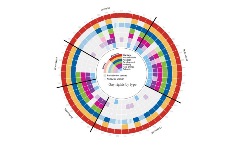
So The Guardian has this page that tracks gay rights in the US by state. It is a 100% awesome. Colored chunks for different kinds of rights, states are grouped so regional patterns are apparent, interactive hovers bring up additional information about the state's legal environment. Hours of fun people!
Awesome interactive visualizations are EVERYWHERE nowadays, but this one is especially special to me. I first saw it 2012-ish, and immediately knew that THIS is what I wanted to do with my life. I had always been somewhat creative, but, I also loved the more technical side of merging data, programming, and statistics with the subject matter. I was utterly FLOORED that someone had combined all the things in this visualization! It was presenting relevant and interesting data in a fun way that people actually wanted to explore! Because it is just so common these days I can’t really get across how big of a realization I had after seeing this, but bravo guardian for inspiring little, queer, entry-level analyst me to get into the field of data science!
Another awesome part is I screenshotted the visualization when I first came across it - yes I really was THAT impressed. They have continuously updated it over time, so now we can see the side-by-side of how much things have changed in the last 5-ish years!
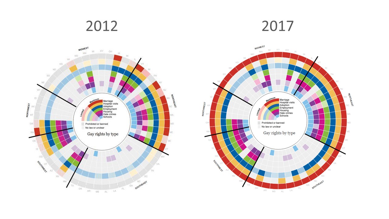
Look at how much we've filled in!!! But, seriously, the static screenshots don't do it justice. Click here to play around yourself!
About the Author
Share this Post