Transgender Day of Remembrance (TDoR) is observed every year on November 20th to honor and memorialize those who have been lost as a result of transphobia. It also calls attention to the continued violence endured by the transgender and gender-diverse communities. I sought to create a visually appealing, interactive data visualization that spoke to both of these goals.
Final Visualizations:
Data
Every year since 2009 Transgender Europe has monitored murders of transgender and gender-diverse people worldwide. They publish a names list every year in November, with available information for each reported murder – the name, age, location, cause of death, and any additional remarks that are known. While impressive given the number of deaths and lack of reporting in many parts of the world, the limited information known about each victim makes it hard to fully honor their life.
In 2018, Anna-Jayne Metcalfe sought out to learn more about all those we have lost. The new https://tdor.translivesmatter.info/ website combines, gathers, and disseminates details about each victim’s life and death in a way that has not been available before, allowing the community to better connect with and celebrate them.
Visualization
Determined to make use of this data to both honor the victims and bring awareness to continued violence, I sketched out an idea for a histogram-like chart that would assign a candle to each victim, allowing the user to hover for additional details. The chart would be filterable by location, cause of death, age, etc.
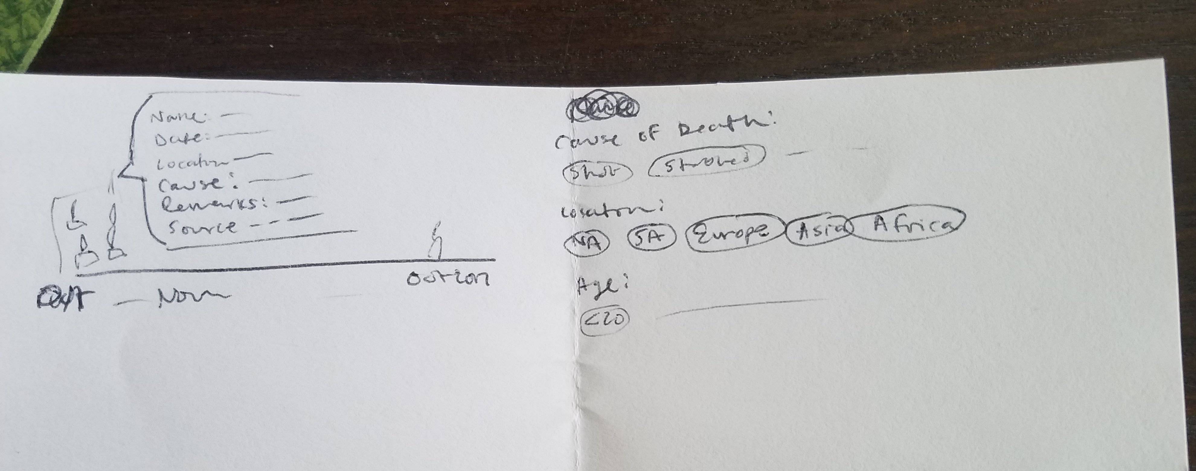
Not a great sketch, but it made sense to me 🙂
I started with this D3 Block from Guillaume Calmettes, which had a dot plot histogram with enter/update/exit patterns. It’s quite clever, creating a container for each bin in the data and then assigning a circle for each data point inside each container. I had to overhaul the binning to accommodate a time axis, settling on weeks after exploring both daily and monthly bins. I tweaked the original update function to accommodate filter buttons for location (by continent). Other variables I had hoped to use had more categories than I anticipated, so I stuck to only a location filter. Ultimately the goal of the visualization was to explore each of the victims, so I felt keeping the focus on the actual icons was a good call. The dots version of the visualization looks like this (TW death, murder, violence, weapons):
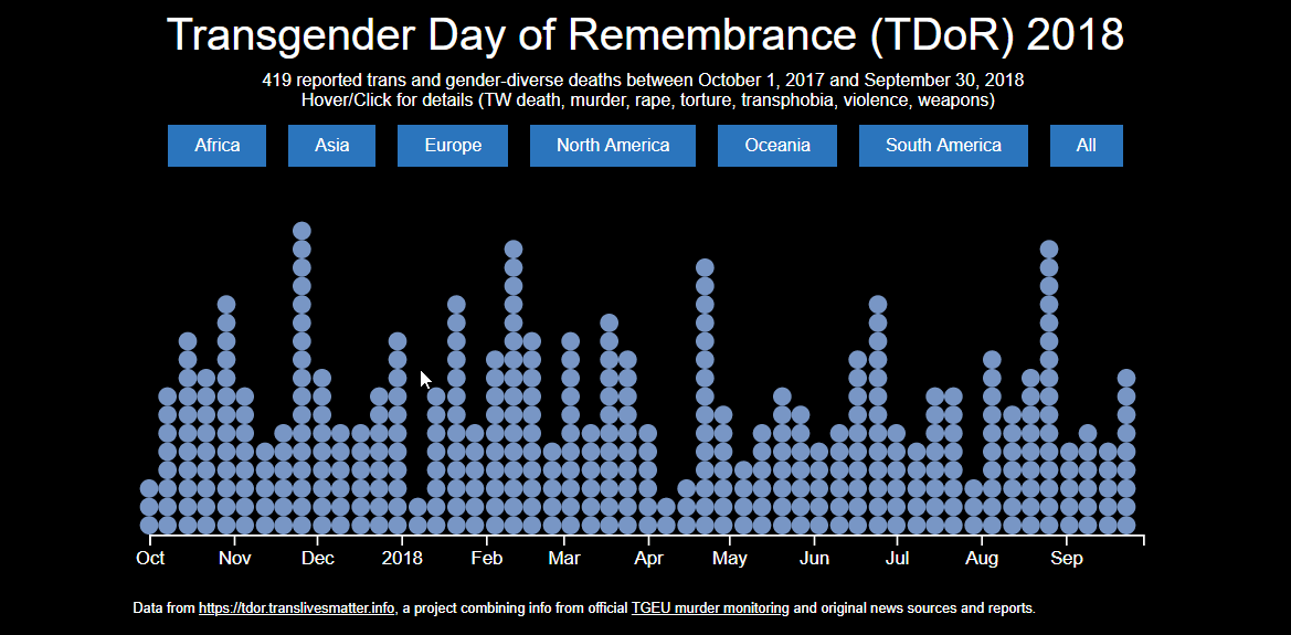
I was pretty happy with how this turned out! I am still fairly new to D3, and am usually shocked when I create something that looks halfway decent. I spent a good amount of time trying to get the styling right - trying to use the colors of the transgender flag, while making sure it captured the weight of the subject matter.
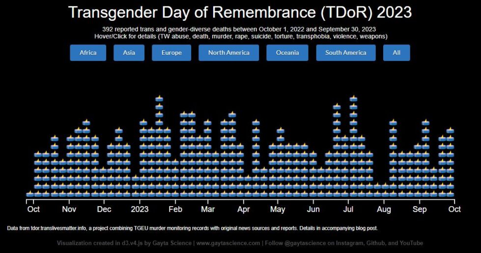
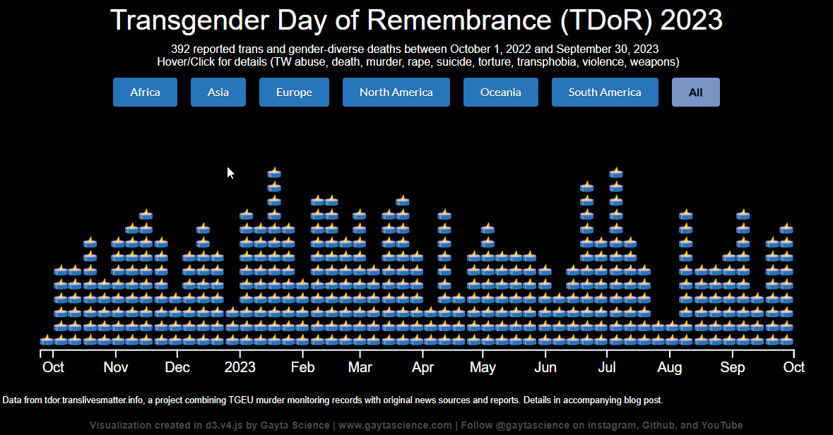
While the dots looked better than I anticipated they would, I still wanted to attempt to make them candles instead. Again, I wanted this visualization to do justice on both goals – bringing awareness to the violence the community faces as well as honoring the victims. I felt that the dots made the victims too data-y, which in this case took away from remembering and memorializing them. I created a couple vector tea-light icons in Adobe Illustrator and then switched them out for the entering dots and mouseover action. Originally I wanted the user to be able to “light a candle” for each of the victims, but each icon is assigned positionally in the bins instead of the assignment persisting between the filters. This means that if the candles were originally unlit, but then were lit and stayed lit as they were hovered over, a lit candle might be assigned to a victim that was not viewed yet when a new filter was selected. I settled for a “glowing” mouseover effect, which I felt was prettier and more appropriate. Each victim deserves a light, even if the user is not able to hover over hundreds of candles. The final candle visualization looks like this (TW abuse, death, murder, rape, suicide, torture, transphobia, violence, weapons):
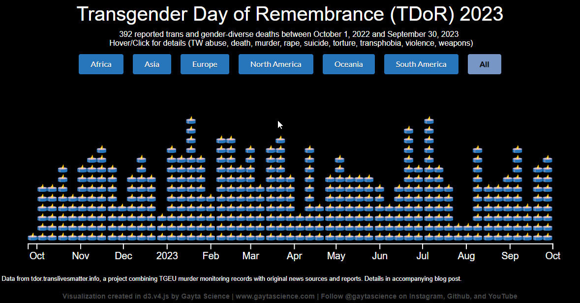
With the enhanced https://tdor.translivesmatter.info/ data becoming available, I was able to further improve the visualization. Starting with the 2020 data, I included the available thumbnail photos of each of the victims in the mouseover tooltip. This simple addition, allowing you to see the face of someone lost too soon, makes the visualization even more powerful. I also made each candle a link to the detailed record page on the site. This allows users to click and easily access the life details of each victim, facilitating that personal connection. I considered embedding more of the details in the visualization tooltips, but I wanted to be careful to not clutter the visual. In addition to mourning, I wanted folks outside of the community to be overwhelmed by death and violence. The chart should be a call to action, things have to change.
Reflections
If you aren’t familiar with this data or the violence toward transgender individuals, particularly trans women of color, let me impress on you how graphic these descriptions are. Reading and re-reading each account to make sure the data parsed and displayed correctly was extremely taxing at times. Hundreds and hundreds of murder and suicide stories, knowing so many more go unreported, is quite draining by the end. However, if you are able, please read these accounts. It is important that we honor our dead, and recognize the violence that is waged towards transgender individuals around the world, in the hope that we can improve the situation.
Final Visualizations: 2023 | 2022 | 2021 | 2020 | 2019 | 2018 | 2017 (TGEU data only)
Data Deets:
This whole post was kind of a data deets, but a few additional thoughts:
Repository with the data and code can be found on github.
(Post last updated November 2023)
About the Author
Share this Post