Plotting Pride SOGIE’s!

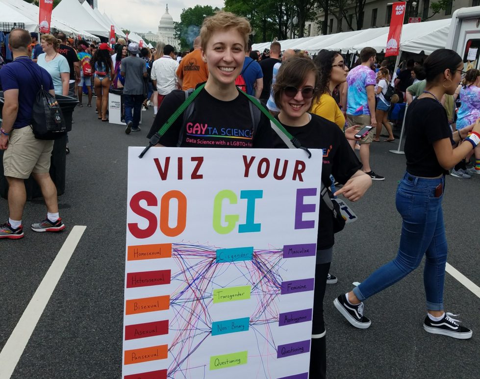
A couple of us on the Gayta Science team decided to take the show on the road this past weekend! We hit DC Pride with the goal to create a collective data visualization of people’s SOGIE’s! SOGIE is an acronym that stands for Sexual Orientation, Gender Identity, and Expression. Which means that EVERYONE has one, whether they are gay/straight/trans/cis/in-between/whatever! We …

Same-sex marriage /r/dataisbeautiful

Every month for 2018 the reddit /r/dataisbeautiful is hosting a data visualization challenge! Each challenge features a new dataset that users get the chance to be creative with, all for a chance to earn “Reddit Gold”. To my delight, February’s challenge was all about same-sex marriage in the US! A dataset originally from Pew Research Center contained the legal status of all …

How much of Pride is for me?

The LGBTQ+ community is very diverse – in terms of race, ethnicity, ability, class, religion, you name it. It also includes a wide variety of things – sexual orientations, sexualities, sexes, gender identities, relationship arrangements, and more. As inclusive as the community is in theory, how much of this is actually reflected in Pride celebrations? Like previous posts have explained, …

No Homophobes

Another awesome gay data viz that deserves a shoutout! NoHomophobes is a project out of University of Alberta’s Institute for Sexual Minority Studies and Services that has been tracking homophobic language on Twitter for years now! The interface features a real-time counter for 4 homophobic terms, a scrolling ticker for the actual tweets (some are really hateful, be careful), and …

Lip Sync FOR YOUR LIFE!

An exploration of lip syncs in RuPaul’s Drag Race through network analysis. The lip sync is the ultimate test of a drag queen’s ability, and the conclusion of every episode of RuPaul’s Drag Race. Using social network analysis, I attempt to explore the lip sync prowess of contestants on the show. Using the frequency that a queen lip syncs, what …

Gay Rights, State by State

Aka the visualization that shaped my career. So The Guardian has this page that tracks gay rights in the US by state. It is a 100% awesome. Colored chunks for different kinds of rights, states are grouped so regional patterns are apparent, interactive hovers bring up additional information about the state’s legal environment. Hours of fun people! Awesome interactive visualizations …